Thursday, 30 October 2014

The September Issue


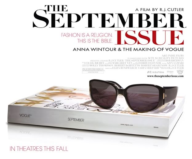
Although this film is all about one of biggest, wait no...THE biggest fashion magazine of all time, Vogue, I had never watched it before, and was really unsure of what to expect. As the posters and online information states that the documentary is about Anna Wintour, one of the most powerful women in fashion, and her team, I wasn't too sure if it would be too factual, and too much like a biography rather than about the processes to make an internationally admired fashion magazine as popular as Vogue.

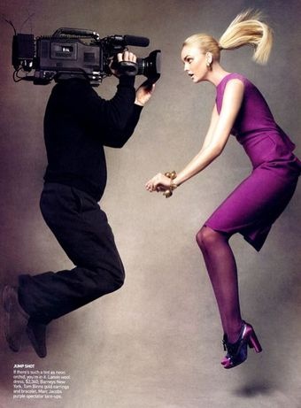
I was pleasantly surprised when watching this film, as it showed footage of exactly how the year's favourite edition (the september issue) is created, getting an inside look at photo shoots, team meetings, styling and fashion shows which the public never get to experience. This was really useful for someone like myself who intends on going into magazine in the future, as I really enjoyed looking at all the different job roles behind the scenes, and how each of these work together to create a beautiful final product. 

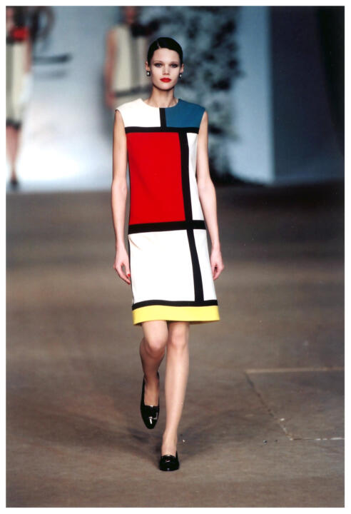
What did come to my suprise was the relationship between Anna Wintour and the rest of her team. Although many young faces are show to be very scared (which is very understandable!) of this fabulous editor-in-chief, Anna held a special relationship with Grace Coddington; former model and current creative director for the magazine. After working together for a total of 20 years, the couple have learnt to push each other to get exactly what they want, and this fiestiness and fight that Grace shows in order to persuade Anna to use her $50,000 shoot images in the biggest Vogue issue ever (September 2007) is really fascinating. Although I knew that Anna, as head editor of Vogue, would get the final say in what goes in the magazine and what doesn't, the film portrayed her as being quite brutal, which actually made it quite heartbreaking to watch Grace's hard work, time and money thrown away in a split second decision. However, this has educated me into the tough world which is media and magazines, and made me even more determind to get involed in the industry in order to ensure that I can get these critiques and improve my style and work further. 

  However, it was also really nice to watch Anna away from work, at home with her teenage daughter. Here she seemed much more relaxed and almost normal, showing how down-to-earth she really is. This is something I really admire about Anna Wintour, she does her job extremely well. She knows exactly when she needs to be tough on her colleuges, in order to get these astonishing results that the public pay millions for each month, but she also has a sensitive side, which makes her so much more likeable as a person. 


Overall, I think this film is 100% a must see for anybody thinking of entering into the world of magazine work. After completing work experience at a smaller fishing magazine company (Total Corp), I was able to get a small taster of what the industry will be like, however this documentary focused particularly on fashion magazines, a compeletly different world which is so elegant, creative and amazing - definitely making me want to continue my journey and goals to being a magazine employee.
#fcpreflection

Wednesday, 29 October 2014

Magazine Image Analysis

During one of our seminars, we were asked to do a detailed image analysis of two magazine photographs; one from a magazine we know of and read regularly, and one from a magazine we have never bought before. I chose to look at Company magazine, a favourite of mine, and I-D magazine, a very popular fashion read, which although I knew about, had never actually bought myself before.


This image was taken from Company magazine October 2014, from page 127 - an article entitled 'Bad Skin Day?'. This image is selling an idea of how to react when you have a bad skin day and has very emotional connotations. 

Denotation
This image, which covers and entire double page spread, shows a female model against a plain, grey, studio background. This female model has very long dark hair and looks to be wearing nothing but her underwear. Using her hands to cover her face, she is hiding from the camera with facial features hand drawn over the top of her palms. These features show sad emotions, with a frowned mouth and tears steaming from the eyes. The subject of this article image (the model), is to the right hand side, with the article text overlaid on the left hand page. 

Connotation
Looking deeper into the image, I believe that the hands hiding the face link to the article about the young models bad skin, expressing the female to feel very embarrassed or upset about her skin, and not wanting anybody else to see it. She has the hand-drawn face on her hands to further highlight her distress about her bad skin, using roughly drawn features to link to the idea that she believes herself to imperfect. The subject of the image has been place to the right hand side of the image as a practical aspect to allow room for the text of the article. However, this may also be to symbolise that the girl feels pushed away and looked over due to feeling like an outcast because of her skin. She doesn't want to be centre of attention due to the embarrassment she feels, explaining why she may not be a central focal point of the image. This image may have also been placed this way to grab the attention of readers flicking through the magazine, as this is the side that they would see when doing this. It would also leave a lasting impression for the reader about the emotions and distress that this lack of self confidence can have to a person as they turn to the next page. I think that the female is wearing little clothing in this image to suggest her being at her most vulnerable time, with a dark, grey, gloomy background to further express her mood. 

I think that this image does link well to the overall impression of this magazine, and would appeal to this particular magazines target audience. The image has a hand-drawn, scrap book style to it, which is very similar to the rest of the magazine, and the face on image immediately addresses the reader, making the article quite personal, another aspect which the rest of the magazine tried to do by getting readers involved with social media to produce user generated content. 


 This image is an advertising photograph used in the first few pages of I-D magazine winter 2014 issue. This is an advertising photograph for the luxury clothing brand, Chanel.

Denotation
This advertising image shows a boxing and exercise gym environment with a red and blue theme. The room is quite dark and gloomy, but these bright colours pop in the background. There are men working out in the boxing ring, and another on a bench, all wearing sports kit. Two female models wearing high fashion from head to toe, with many different textures. These clothing items are mainly dark colours, with hints of red or blue in them too. They are leaning against some gym weights, face on and making eye contact to the camera. This image also uses a shallow depth of field in order to create a blurred background and a focused foreground.

Connotation
I think that this image uses quite dark backgrounds and environment to create quite the impression that this is a serious and almost dangerous environment. However, this also works well against the models darker clothing items, making the different textures such as leather and lurex stand out more against this otherwise plain background. However, the pop of colour adds fun and energy to the image, suggesting these are still Chanel brand values, whilst also emphasising the accent colours on the Chanel bag and creating a recognisable colour scheme which many often associate with boxing. The men in the background as blurred due to this shallow depth of field technique used, and I think that this suggests that they are no longer the dominant humans. The female models in the foreground of this image are therefore in focus, looking strong, determined and stern as they lean against the heavy workout weights, as if they are ready to take control. I believe that this sends a message to consumers that women are independent and strong, but still beautiful and very glamorous at the same time.

I think that the message behind this Chanel advertisement will really connect with the consumers of this magazine, as they are likely to be young female adults, who are also very interested in fashion. It sends a strong message about women's importance and suggests us to be more superior than men, fighting the stereotypes which are normally played upon in other advertisements which normally over sexualise women. I think that this will really hit the target audience of I-D magazine, as this magazine is attractive to quirky fashionistas who like to see themselves as being unique and individual to others, therefore this apposing stereotype will definitely leave a lasting impression in their minds.
#fcpreflection

Tuesday, 28 October 2014

Burberry VS Chavs

Looking at Burberry, it is pretty obvious that they are doing very well in the fashion business. As the brand of the future, Burberry uses amazing technology online and in stores to communicate with their audience. But it wasn't always this way, as I found by watching a BBC documentary from 2006 entitled Burberry vs Chavs.

Burberry, a traditional British heritage brand became a household name when they became the first brand to design the trench coat. As this iconic clothing item became more and more popular, so did the brand. However, during the 1980's, Burberry went downhill as it lent its name to products such as whiskey, becoming disassociated with its British heritage. In an attempt to boost sales, a new chief executive was appointed, Rose Bravo, who made the brand more appealing by hiring Kate Moss the new cover girl for Burberry, the hottest supermodel of the time! Rose Bravo also added accessories and premium brand labels to the company whilst employing Gucci's designer, Christopher Bale, to add a new fashion edge to the products. All of this work combined caused an uplift in the brand, where the classic Burberry check became an iconic fashion figure with all the top a-listers wearing it.
 
 But as a fashion brand which aimed to be both aspirational and affordable as a cross-generation label, with a price ranging from £15 to a checked bandanna, to £2000 for a premium shirt, issues began to arise. Football hooligans began to wear this respected check symbol as a way to out dress their opposing teams, and at the 2000 euros, the famous check was splashed all over the front papers by these troublemakers, giving the Burberry check it's first bad press. By 2001, there were fake items all over British markets. 


From then onwards, things only got worse! Michael Carrol, so-called king of the chavs, became famous after winning nearly 10 million pound on the lottery at 19. He was rough and tough, but found an immediate love for Burberry. In 2006, he estimates that he spent over £3000 on the brand, and this chav character was not the ambassador the brand wanted. Daniella Westbrook, former Eastenders soap star and cocaine addict (who lost half her nose), was also captured wearing head to toe of the checked brand, which immediately caused Burberry to instantly be associated with thugs, chavs and tack. Burberry knew that something had to be done, especially when the recently a-list brand was becoming banned from pubs and clubs around the country. But there was still hope. Sales were only falling in the UK, with a global profit of £150 million, as it was only in Britain where this association was becoming a huge deal.

In order to try to save the brand, Burberry stopped selling their cheaper option, the checked hat, and adopted a less is more approach, having only 5% of the checked symbol on the catwalks, as appose to 20% the year before. The company also began to employ people to detect fake products sold online, however this did not stop markets from flogging fake goods, even the discontinued hat remained a top seller!

Burberry continued to fight the issue, and today have pushed most negative stereotypes to the side, using a much more minimalistic styling in order to disassociated itself with these chav representatives. In my opinion, Burberry has changed its whole approach, now targeting a much younger target audience, becoming much more upmarket by using technology and digital media in order to create a wow-factor. Burberry began to use digital language to communicate with its younger target audience, in order to add personality, be more visual and create energy surrounding the brand. Using music, an aspect which is very important to this particular type of customer, Burberry created a section on their website called Burberry Acoustic, which showcased new British talent and streamed this live to their virtual stores across the UK. This created a sense of quirkiness and uniqueness to the brand, giving it a whole new identity, which is now much more respected that the old, tacky one. 

 I think that this whole re-branding and a new fresh faced model, Cara Delevingne, allowed Burberry to start fresh, and has really turned them from a zero brand to a hero brand. They are now one of the top designers at fashion weeks across the globes, and are back to being aspirational, exactly where they have wanted to be since their disasters began in the early 2000's.
#fcpreflection

Monday, 27 October 2014

Louis Vuitton: Art, Fashion and Architecture

After watching the documentary previously posted about, Marc Jacobs and Louis Vuitton, I wanted to know more about their work, particularly looking at Louis Vuitton, as the film seemed to look more into Marc Jacobs personal brand. In order to do this, I looked at a book entitled 'Louis Vuitton: Art, Fashion and Architecture'. The book is a huge collection of Louis Vuitton work, with collaboration information, worldwide store designs, iconic campaigns, shows and products. The book is very visual, but also uses built in essays and research into designers the brand has worked with in order to create a very factual and beautiful book which I would definitely recommend to anyone!

Looking at an insert art essay written by Jill Gasparina, I was able to get further insight into the famous Louis Vuitton patchwork bag which I was fascinated by during the documentary. I was really interested in the way in which Marc Jacobs was able to design and create this unique bag, and this essay highlights process of the concept meetings with the bag, and also about the shock and media obsession over this bag. I really enjoyed reading further about how this bag caused so much inspiration to the fashion world, and the essay continues to explain the history of Louis Vuitton and how a passion for art has really inspired designers. This was something that related back to the documentary, where Marc Jacobs is shown to gain influences from some of his favourite artists, and I really love how the book reiterates this passion and love for art; expressing how inspiration can come from all types of art form. 


The book also shows some other amazing collaborations that Louis Vuitton has done, with artists, designers and photographers. Reading through these, I was unaware that one of my favourite photography duo, Mert Alas and Marcus Piggott, had done shoots with the brand. During my Alevel photography projects, this pair were a very strong influence of mine, encouraging me to think outside the box and be over extravagant with fashion photography, inspiring me to look into ideas such as using fairy tales as influence, and also to pursue underwater photography during the course. Mert Alas and Marcus Piggott have being working on campaigns with Louis Vuitton since 2002 for their ready-to-wear collections, and the book explains a bit about the history of the photographers and their work with the brand. 

In my opinion, Mert Alas and Marcus Piggott's work is very energetic and dynamic, making it look fun and attracting to the eye. They're work has always been a favourite of mine, and I love how they can tell a story with their images, taking you to a fantasy world whilst still making their models and fashion items look glamorous and elegant. The book explains how they like to focus on the appearance of the model rather than on technical aspects, something which is unusual for professional fashion photographers, and I believe that this is what makes their work so unique to other people. They like to put their own spin on things, and often work with the stylists in order to create their ideal creation, and inspiring aspect which shows their creativity as well as their photographic skills.

I was also attracted to work by Vanessa Beecroft, an artistic director I had not heard of before. Learning about her work with Louis Vuitton was fascinating, and I really love the ideas that she used with the brand, especially her choreography which was performed January 2006 at Espace Louis Vuitton, the 7th floor gallery of the Champs-Elysees flagship store. The models were told to be natural and plain, not to smile and do not move, whilst almost naked, with just small pants and heels with laces up their legs. The models sat on the shelves of the store, spaced around the Louis Vuitton accessories. This unique idea created live mannequins, and was a very unique aspect which brought Louis Vuitton to the medias attention. 

I think that Vanessa  Beecroft chose to do this in order to express the models as natural beauty's, whilst also not taking away the exquisite detailing on the Louis Vuitton bags, which sometimes cannot be appreciated with moving models. It also suggests that these accessories not only complete an outfit, but can also create one, expressing how their are so glamorous they do not need extravagant clothing to look beautiful. 
#fcpreflection

Friday, 24 October 2014

Vivienne Westwood vs Urban Outfitters

 After looking at brand stories during our seminar last week, particularly the links between Roberto Cavalli and River Island, we were asked to look further into this, focusing on similar brand stories and values between another high end and high street brand we had discovered ourselves.

Taking Roberto Cavalli and River Island as inspiration, I decided that I wanted to look at other brands which focused on quite playful and dynamic campaigns, which really had fun ideologies behind them. I felt that Urban Outfitters hit this very well, as always showcase fashion images where there is a lot of movement from the models in quite familiar and realistic locations, as the brand describes themselves as being for the 'urban-minded individuals'. I also felt that Vivienne Westwood's brand links to this urban vibe, celebrating imperfections and having an emphasis on youth culture.


Top image: Vivienne Westwood spring/summer 2010 campaign
Bottom image: Urban Outfitters Mink Pink global campaign 2013

I think that this focus from grunge and youth culture stems from the background and products of both of these brands. Vivienne Westwood as a British fashion designer became popular throughout the 1970's punk movement, and used the urban grunge lifestyle as inspiration for her designs and dressing influential punk and rock music stars such as The Sex Pistols. Using political issues and musical inspiration, Vivienne Westwood's brand grew to be a form of expression. Therefore, she incorporates cultural history and music culture into her products and really emphasising that this urban and grunge fashion is not just about clothing,but using campaigns to sell a punk lifestyle.

Urban Outfitters also uses this punk lifestyle as a brand story for their high street brand, selling not only clothes and accessories, but also books, home ware and furniture in their stores to really emphasise the idea that youth culture and grunge grew from cultural history and should be taken as a way of life, not just in the way we look. Urban Outfitters, also founded in the 1970's, incorporate historical fashion and music movements into their products, look at motif t-shirts and Polaroid cameras to highlight their vintage and retro inspirations. Both brands are very passionate about this punk movement and celebrate creativity, musical and artistic influences.


Top: Vivienne Westwood fall/winter campaign 2014
Bottom: Urban Outfitters fall/winter campaign 2014
 #fcpreflection

Tuesday, 21 October 2014

Japanese Cult Party Kei

 Another very unique street style I came across around the University. This Student looks adorable in her frill layered bubblegum pink dress and blue laced cardigan, giving her an authentic Japanese style look which may have been inspired by the Japanese street style, Cult Pary Kei. I admire this students confidence to wear such different and unseen clothing, and it works really well with her natural make-up and pig-tails complete with bow, to really emphasise the doll look that she is trying to achieve!
#fcpreflection

Monday, 20 October 2014

Marc Jacobs and Louis Vuitton

Watching this documentary as part of the fcp course was really amazing, as I was unable to find this prior to the course on any other website, but still wanted to watch the documentary. Following the man who really invented the fashion phenomenon which is grunge, the documentary delves into work for Marc Jacobs own brand, and with his collaborations as Art Director at Louis Vuitton for the spring/summer collection 2007. Before this documentary, Marc Jacobs process to creating these extraordinary fashion pieces had never been filmed, and so this documentary gave a great and unique insight into America's most influential fashion designer of this generation. 

Looking at the processes which occur between initial ideas and creation is fascinating, and that's my favourite part about this film, it's not afraid to show you exactly what happens between the production and the catwalk. I loved watching the ideas come to life, beautiful fashion products created from rough ideas; such as Marc Jacobs fresh idea to piece together many iconic Louis Vuitton bags onto one accessory.

"It might be a good idea...
we'll just use a little of everything"
 

- Marc Jacobs
It's these crazy ideas that actually are brought to life that really made me appreciate Marc Jacobs work throughout the documentary. His thoughts for designs spring from anywhere and everywhere, and that really is a true natural designer who was born with the innate ability to produce beautiful fashion items.
His process of making these items is very rough, using a cut and past strategy with no dress forms used. Instead, Marc and his team would pin bleached flowers, frayed fabrics or distressed materials straight onto the model, before creating the drawing which would be sent to the workshop team. This allowed Marc Jacobs to work with ideas and almost adopt a trial and error technique to see what would work best.
The documentary also reiterates something which I have found from many of the films and books that I have read whilst here at university; that inspiration can come from anywhere and from many Marc Jacobs looks everywhere for inspiration for his collaborations with Louis Vuitton, and often this comes from his love of art. This documentary delves deeper into where some of his greatest inspirations came from, showing his meetings with Japanese artist Yayoi Kusama to create a Louis Vuitton bag which is completely decorated in dots.

I also think that Marc Jacobs adapted this idea he used for Louis Vuitton for his own brand, based in New York. Using many designs which featured different sizes of circled dots covering products, such as his fragrance 'Dot', suggests how this Japanese artist played a huge role in his design ideas and thought processes.

The documentary focuses on the two main shows that Marc Jacobs is involved with during this spring season, his own brand in NYC and the Louis Vuitton catwalk in Paris. Whilst both use intricate detailing and vast amounts of colours on the catwalk, the atmosphere between each brand workshop is completely different. Marc Jacobs' branded workshop is much more laid back, as the worker describe it as feeling homely and the other members of the team as staff members, but Louis Vuitton's workshop is much more rushed. I think this is due to the close relationships Marc has with his collages in his own studio in New York, as this encourages the seamstresses and artists to work throughout the night as they enjoy it there. However in Paris, as that relationship is not there, and Marc Jacobs rarely sees the production team, therefore creating a much less friendly and relaxing atmosphere. The expectation for Paris as a fashion city is also extremely higher than American cities, with Paris being the capital of luxury fashion brands such as Louis Vuitton. I think that this creates different pressures around the globe, as represented by the rush before the live catwalk in Paris, with the last garment reaching the venue only seconds before the show began!
   
Left-Marc Jacobs NYC spring catwalk 2007. Right-Louis Vuitton Paris spring catwalk 2007,

Overall, I really enjoyed this documentary, and found it very inspiring. I have never really witnessed how the fashion garments are translated from drawing to the catwalk, and this has given me a much better insight into the ways in which fashion pieces are put together to create a catwalk show. I would highly recommend watching this documentary if you can get your hands on it, as it really does express the passion that Marc Jacobs has for clothing and accessories, and is a really great backstage pass into the mind of a fashion genius!
#fcpreflection

Pinterest

Just been introduced to the world of Pinterest and I'm already obsessed! Please help me out by following my boards and I will definitely return the favour by checking yours out too!

Pinterest: http://uk.pinterest.com/laurrrobertson/

Sunday, 19 October 2014

River Island vs Roberto Cavalli

Whether high street or high-end, there are only so many brand stories a fashion brand can offer to its consumers; for example Jack Wills offering traditional heritage whilst All Saints uses urban rebel. Learning about these during a seminar this week, we looked at the similarities certain brands have to each other, not necissarily just with their products, but with their brand values and stories.

Looking at the high-end brand, Roberto Cavalli, and the high street store River Island, there are many similar techniques used across their marketing strategies and promotional images. 

Looking at these two promotional images, it would be very difficult to differentiate between the two brands, and it could be possible that you may think that both are representing the same clothing line; even though the top is River Island, and bottom is Roberto Cavilli, both with different price ranges and target audiences. When asked to describe the relationship and brand narrative similarities between the two brands, I began to become more comfortable with what these brands are trying to represent.

Both of these brands use quite colourful and youtful campaigns, showing how they are targetted towards a fun and playful audience. Listing words such as metallic, noisy, sharp, bold, electric, sensual, italian and unpolished helped us develop a better understanding of the companies brand values, and I was able to put together a series of phrases to describe their brand story and identity.

"Unrefined clashing bright prints, wild and dynamic
embelishments with an urban pop glamour"

I feel that this string of adjectives really describes both the fashion identity and values of these brands whilst also demonstrates the similarities between brands which are targetted at completely different markets. But why do different market levels both have the same story? I think that these high street brands are trying to keep up with the high-end retailers and want to make their brand appeal to fashion consious consumers. This target audience will recognise the similarities between brands, but may not yet have the lifestyle to purchase these expensive designer brands. Therefore, stores such as River Island use these similar techniques to reach aspirational consumers. I really enjoyed this task and can't wait to look further into the brand identitys of other brands, as they really do all show overlaps.
#fcpreflection


Thursday, 16 October 2014

Colour Palette Trial


During the past few weeks of the fcp course, we have been developing ideas on a possible colour trend to focus some work on. Choosing this story itself was quite difficult, as I wanted to push myself out of my comfort zone. I have always used pastels and slightly quieter tones when associated with fashion photography or media previously, and so I decided a change was in order. Therefore, I decided to use block primaries; red, blue and yellow which have been used together in a bright contrast to create a vibrant look. Using this colour story, I collected clippings from magazines and took photographs to create an idea of how these colours have been previously used in both the fashion and lifestyle industry. I particularly looked at the YSL block patterned dress (as shown here); which was initially inspired by the famous artist, Mondrian, and became popular during the 1960’s, and used this to help me create a colour palette based on all the information I had collected.


Choosing the right shades of blue red and yellow was particularly difficult, as although this was a clashing and bright palette, I still wanted them to work well together, and not be too ‘in your face’ that they would not be wearable as fashion. Taking this into consideration, I dulled down the brightness of the yellow so that it was still a stand out colour, but could be interchangeable in future with both the red and blue. I also decided to incorporate some neutral colours into this palette to add complexity, but also more options for designs; as I had found many designers use these bright primary colours with more basic colours to make them stand out even more against these plainer shades. Beginning with black and white, I then altered them slightly so that the white had a hint of cream in it, and the black a charcoal colour, as felt this would add more sophistication to the palette rather than using these stand out basics. I also altered the placement of these colours so that they were ordered from lightest colour to darkest, as in my opinion, this works best to the eye and makes each colour eye catching.

sing these finalised colours, I then looked at the volume and proportion of each colour section. Beginning with using the bright primary colours as the main focal points of the palette, I decided to use the blue as the dominant colour, as found that on my mood board, around half of these photographs used this cobalt blue. I then used yellow as the next largest colour section due to 30% of the images using yellow, and only around 20% of the images I liked used red, causing me to decided to represent this with giving it a much smaller section of the palette. Taking the YSL dress as inspiration, but adapting to suit the research I had done, I separated the colours in block patterns using the white and grey as separators. I really like the way that this created a fashion-focused and influenced palette which really represents the information I had previously collected about these colours. I also feel this gives the palette more depth as has deeper connotations behind it which link well within the fashion industry.
 
However, I also wanted to experiement with opposing proportions, using the grey and white as main colours with the primary bolds as accents. This is shown in the colour palette created below, however I do no like this one as much and much prefer the YSL block inspired one above, as feel this better represents the theme I am trying to portray and the findings I collated during research.

I plan to continue experimenting with the proportions and tones of these primary colours in order to ensure they are perfectly representing my ideal colour palette. I hope that by doing this, will give me a better understanding of where to go with the next task, and will act as a cue to the colour themes I may use throughout this project, and what proportion of colour I should be using most and least. I really enjoyed this task, and can't wait to see what we do in next weeks seminar already!
#fcpreflection

Wednesday, 15 October 2014

Planned Obsolescene

Recently I sat down to watch the first episode of the BBC2 documentary 'The men who made us spend'. The programme attempts to find out the reasons why we as consumers continue to buy products, even though we have similar ones that work completely fine. Investigating the consumerism and the people who try to make us spend, the documentary aims to show us the tricks of the trade, and why these make you want to keep spending your money.

The first episode of this 3-part documentary looks at the issue of planned obsolescence; the idea that manufacturers will purposely created a product with a shorted life-span so that consumers will buy a new one. This of course acts as a catalyst for these money makers, as ensures they will continue to make their money, even when people have already purchased. This makes perfect sense to me from the companies point of view; "It's much harder as a brand to get someone to buy a brand for the first time". This quote stuck in my head from my lecture on 'what is a brand?' by Si Beales and Chris Macdonald, and I really can apply this to the idea of planned obsolescence. Once customers have purchased a product for the first time, they become more familiar with it and so are more likely to buy again. But why does this apply even if that product had broken? Why would the consumer want to buy a faulty product again, and should it be legal for companies to continue to use planned obsolescence?


 Planned obsolescence first got brought to the public's attention during 1924, when light companies joint together to create a Phoebus Cartel. This worked as a way to increase sales, whilst lowering the life-span of these light bulbs magnificently to only 1000 hours. This meant that the public would have to buy more frequently, therefore making the companies more money. Any light companies involved in this cartel had regular tests, and if any bulbs were found to have longer than 1000 hours of life, they were fined accordingly, ensuring that all manufacturers kept to their promise. Sales increased by double for all parties involved in the cartel over 5 years, but was this fair? Should it have been alright for the producers of these bulbs to trick the public into believing that these bulbs would actually be better quality whilst getting more money out of them and surly they are not still using these 

This issue of planned obsolescence stood out as the most shocking part of the documentary and really got me thinking about companies and how they will do anything to make money, even if it does mean tricking their loyal companies. However, it is still possible that companies could be using a version of planned obsolescence today. Researchers have found that products such as ink cartridges have been programmed to say that they are empty and need to be replaced, even if they are not. Some of these cartridges when reset by professionals can actually go through this process three times before actually having no ink left! I think that this is completely ridiculous and should not be legal for companies to do this. In my opinion, this is a form of scamming customers, making them spend unnecessary money. 

 Even one of the most successful brands to date, Apple, has been suggested to use a form of planned obsolescence. Large companies, such as Apple, often use large and expensive advertisements to make you invest in their products. But once you have bought, how are they going to ensure you keep purchasing. The Neistat brothers suggested that using planned obsolescence has allowed Apple the ability to do this. After buying and owning an iPod himself, Casey Naistats Ipod lost battery very quickly, and he wanted to know if Apple could do anything about this. After talking to a representative, he was told that there was nothing they could do as the battery would begin to run after owning it for 18 months. Outraged, Casey and his brother created a campaign to make the public aware of this, creating a video showing them graffiting over the top of all the Ipod adverts they could find in NYC. The video went viral, why not take a look!
 Apple are still criticised today for their suspected use of planned obsolescence, for example with their iPhones. After the release of the iPhone 4, the models were unable to be taken apart unprofessionally to replace a battery, meaning if there was an issue, the customer would have to send directly to Apple, costing the consumer money of course. Apple even designed their own screw which had never been seen before to hold the phone together, deliberately so that no one apart from the Apple team could attempt to repair the phone. I think that although this is a clever move from the company, it really does suggest their ideologies towards customers, showing how they obviously do not care about offering reliable products to their loyal customers. 

 But why do we keep buying these products, even though we know in a year or so we will have to spend more money for a new one? Is it the want for the new colour or shape? Or is it just that we don't want to be left behind or seen as 'unfashionable' by not having the newest version? Watching this documentary has definitely got me thinking about the quality of these so-called 'best' technology companies and has really made me reconsider buying from them again.
I really do hope that more is done to product consumers from becoming victims of this, and hopefully more of the public are made aware of the companies who are doing this so they can avoid being targeted. Could this spread past electronics and move towards fashion? Will clothing manufacturers and designers start using weaker and lower quality fabrics so that they rip, tear or wear more easily, making them have to continuously make new purchases, or are they already doing this? It's an issue which investigators will continue to work on to try and solve and I hope that something more serious is done about it sooner. 
#fcpreflection